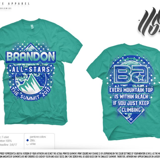
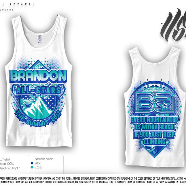
Why is "mountain top" one word on the tank and two on the tee? :p
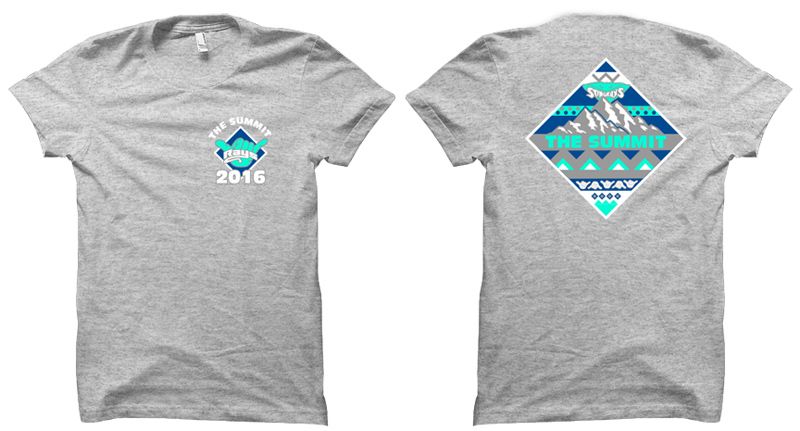
Anyways reminds me of Rays' summit tee from last year which I LOVEDDDDD. I love when gyms have clean designs that don't have an absurd amount of random graphics slapped everywhere with bright colors.
ETA: Went back to last years thread to admire the Rays shirt but the image is gone. Coincidentally, you posted it and I said the same thing about liking the cleaner designs. Things dont change I guess. (Especially the frequency of bad designs.)