I like these- the one thing I'm not totally sold on is the top half. Something about the body location where the blue and black meet just doesn't visually appeal to me. I get that they wanted it to match the guys, but I wish the cut was different.
I think it's the downward (upward?) white arrow and the positioning of the blue/black that makes it seem like it's pushing "the girls" down. If that makes sense... a lot going on up the top of the uniform and then nothing under the Atomic. Overall simple and pretty, just proportions are slightly off.
I don't know how I feel about the Western uniforms. To me, they don't seem as "iconic" as their previous ones. Also, the run 1/2 uniforms look very similar to each other and I almost don't see the point in having two of them.
On the other hand, they are still pretty cool, if a little on the short-skirted side. Nice collegiate-looking sublimation!
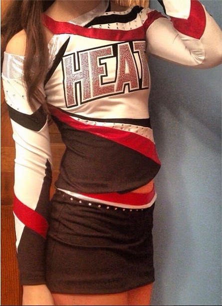
My gyms new uniforms - we love them! They are flattering on everyone and we're super excited. :) I know there's a lot of mystic but I like it anyway, probably biased because it's my gym though!
All of these international uniforms are so beautiful. I really hope they stay like that instead of the direction American uniforms tend to be heading in.
This is Black Widow's (gym from Canada) new uniforms for their IOAG5 team! I think they're prettier in person too, very sparkly and look really good on the floor
Same.... Idk what about it makes it $500. There are rhinestones but not $500 worth, and there isn't like a ton of special fabrics or anything,,,it's pretty simple